
UNIVERSITY DESIGNS
A collection of projects that were completed as part of my education at The University of the Arts in Philadelphia. Two-dimensional content includes typeface design, fine arts, and graphic/digital design while three-dimensional art features plastic and wood mediums.

3 - DIMENSIONAL

The design tested the ability to create 3D art on a large scale. Due to its size, it was never tested in the production process and was inflated only once. The significance, therefore, was in capturing "the moment" when it was filled with air and stood in all its majesty.

MONUMENT // plastic drop cloths, duct tape, shop vacuum for inflation, friends to help!

KEEP THE CYCLE // hand carved wood

The form of the sculpture was inspired by the sound of a trumpet in a particular song (yes, it was the early 2000's and it was a ska band). In the beginning, blind sketches were developed while listening to the music and drawing freehand with eyes closed - resulting in the organic form. The design suggests the rhythm of the music in an abstract way.
2 - DIMENSIONAL
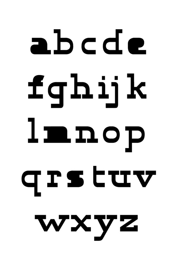


KLAMPE TYPEFACE // photocopy type trials, plaka paint studies, TypeTool digital renderings, Adobe Illustrator
Klampe is a hand drawn slab-serif typeface inspired by the distortions that occur to a typewriter font when extremely reduced and enlarged on a photocopying machine. The filling in of letters, as well as the linking of serifs, resulted in a rich texture and unique ligature pairings.

NO PREY, NO PAY // hand bound book with accordion folded digital print insert
Senior Degree Thesis Project: This book was designed around text excerpted and edited from the book "The Pirate Wars." It was intended to inform about the reality of the Golden Age of Piracy.
Through the integration of real image photography with classic historical images, the project aimed to remove the topic from the kitsch and romantic quality our culture has assigned to it.
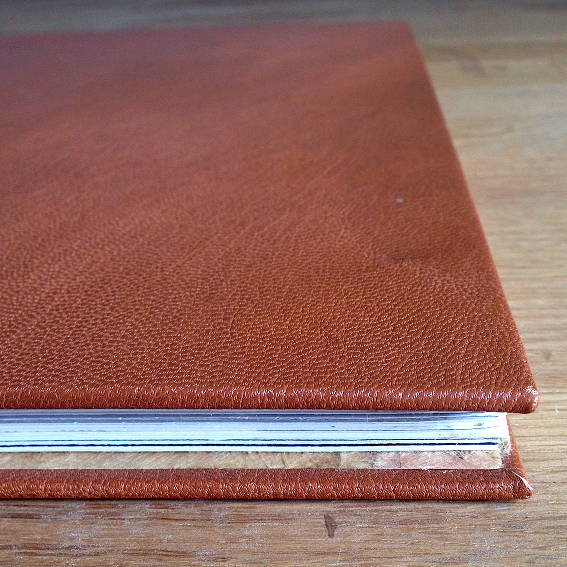
book was covered in real leather

cover page featured a gold leafed Jolly Roger


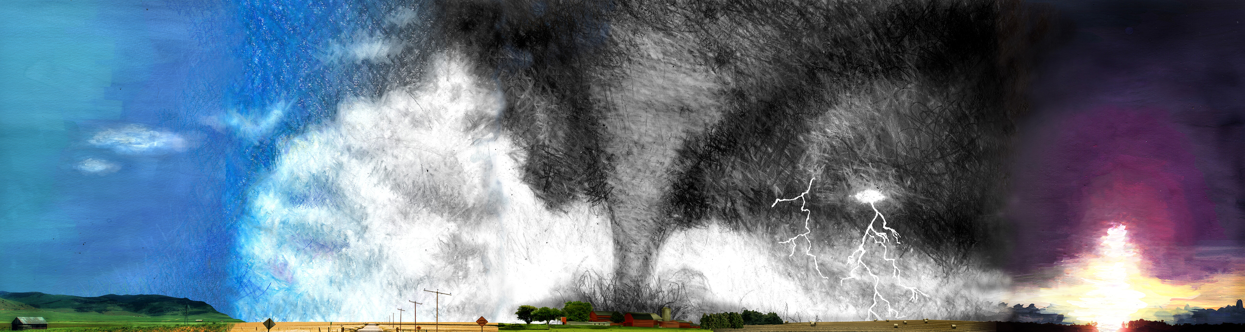
MIDWESTERN MEMORIES // single image mixed media, including watercolor, colored pencil, charcoal, gouache and Photoshop
A five "panel" interpretation of space that illustrates how I remember the Midwest from my childhood. The drawings and paintings show how the skies were vast and ranged in intensity, and how I remember them being anchored only by small, flat strips of land.


DEFINE YOUR DANCE! // corporate identity
A corporate identity that was designed and developed for Zone, a cable television channel that offers a modern approach to instructional dance and exercise programming. Zone is for those who are inspired by new forms of dancing, exercise and expression, and want the experience in the comfort and privacy of their own home. The applications created include the logo, image, font and color palettes, as well as print (mailers) and a website.


JUNIPER // drawings and paintings